

There are a number of books I want to read which are either completely out of print, or else only available in utterly hideous print-on-demand editions with vile typography and crappy covers. A number of these books are out of copyright, and so potentially open to anyone to make their own editions (hence the vile/crappy versions described above). Having experimented with print-on-demand technology, I thought I'd have a go at creating a couple of physical books myself. It was lots of fun, and I got hooked. The result is Whisky Priest Books: out-of-copyright books I want copies of, and which, with any luck, other people might want to read as well.

I started with Fitz-James O'Brien. An Irish-born poet and journalist who was killed fighting for the North in the American Civil War, he was also responsible for a notable series of early science-fiction and supernatural short stories. One or two of these occasionally crop up in themed anthologies, but there was no decent collection of his work available. So I made one. The title story, The Diamond Lens, is probably his best-known. In it, a man who has built a super-powerful microscope discovers an entire miniature world inside a water drop, including a beautiful (but microscopic) naked woman, with whom he falls in love. The cover pretty much suggested itself (click for bigger versions of all cover images).

My other starting book was as pretty much as odd as literary oddities get. Having read and thoroughly enjoyed Melville's Moby-Dick, I was reading some essays about the book. In one, by David S. Reynolds, I came across this intriguing sentence: "The largest monster in antebellum literature was the kraken depicted in Eugene Batchelder’s Romance of the Sea-Serpent, or The Ichthyosaurus, a bizarre narrative poem about a sea serpent that terrorizes the coast of Massachusetts, destroys a huge ship in mid-ocean, repasts on human remains gruesomely with sharks and whales, attends a Harvard commencement (where he has been asked to speak), [and] shocks partygoers by appearing at a Newport ball...”
The audience for an 1850 book-length Monty Python-style doggerel poem about a socially aspirant sea serpent is probably just me, and it would be honestly impossible to press this on anyone as a great (or even good) work of literature, but I'm glad to have read it. Such an overblown book seemed to need a relatively minimalist cover, so I used a detail from one of the book's original illustrations.

Book three was a collection of the Edith Wharton novellas and stories I didn't already have in my numerous collections of her shorter works. A lush John White Alexander painting ('Repose', from 1895) seemed right for this.

At this point I became pretty bored with the blue rectangular author/title box, and decided to chuck it in. This was a good idea, as it gives a lot more flexibility in cover design.
Lord Dunsany (or Edward John Moreton Drax Plunkett, 18th Baron of Dunsany) is still in print today, known for his remarkable fantasy stories. His other work is less well known, and Tales of War was particularly interesting. Drawing on his own WWI experiences, its protagonists include numerous soldiers, Kaiser Wilhelm II (the theory is advanced that he started the war to compensate for his ludicrous moustache) and a talking gorilla.

Two other WWI novels also caught my eye: Contemptible by 'Casualty' (Arnold Gyde), a straightforward, thinly fictionalised version of his own fighting experience in France, and A. P. Herbert's The Secret Battle, which was one of the first novels to look at shell-shock and the odiousness of capital punishment for desertion and cowardice in battle.
 |
| This cover makes use of 'Battle-Scarred Sentinels', one of the many frankly astonishing photos of Australian war photographer Frank Hurley |
 |
| This cover features an adapted version of a pencil sketch by Dutch cartoonist Louis Raemaekers |
Storm Jameson was once widely popular, but her work is now almost entirely (and unfairly) forgotten. My favourite of her novels is In the Second Year, first published in 1936, and describing a Britain where the Fascists had taken government. For this cover I lifted a frame from an old newsreel of a British Union of Fascists rally.

French novelist Henri Barbusse's early novel Inferno, from 1908, is a neglected classic of existentialism and voyeurism, if that's your cup of tea: a near stream-of-consciousness narrative from the point of view of a man peering through a gap in his boarding-house room wall at the goings-on in the neighbouring room. The oppressive ranting of the text and the peering eye suggested a design for this one (click for a better view--the text doesn't display well at the smaller size).

As you can see, it's hard to stop once you start down this self-publishing path. Who else do we have? How about Leonard Merrick, as championed at The Neglected Books page here and here?
 |
| This tale of a writer whose first book is hugely successful, but who then starts to bomb in a big way, needed a thoroughly fucked-up typewriter... |
 |
| ..while this book, much of which concerns an aspiring actress and her attempts to secure work, seemed to need this portrait from an old theatrical poster. |
Or Grant Allen, a number of whose other books I've really loved, and whose Michael's Crag (about a man who, after a blow to the head, becomes convinced he's the archangel Michael) was discussed at The Dusty Bookcase?
 |
| Here you can see the whole cover, front and back. The image is one of the book's 200+ silhouette illustrations, by Francis and Alec Carruthers Gold |
 |
| I couldn't resist Egon Schiele for this: it's his hypnotic 'Sitzende Frau mit hochgezogenem Knie' (1917) |
 |
| The cover uses 'Model writing postcards' (1906) by Carl Larsson |
Or Grete Lanier's diary of her schoolgirlhood in early 20th-Century Vienna, originally published by Sigmund Freud?
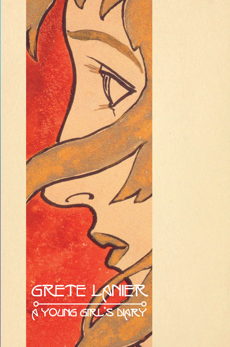 |
| This cover uses a detail from ‘Profilbildnis eines Mädchens’ (1897) by Koloman Moser, a number of whose paintings capture Viennese adolescence rather intriguingly |
So, that's the start of Whisky Priest Books. See some of them at Amazon US, Amazon UK, or all of them at the Whisky Prist Lulu shop.
No comments:
Post a Comment